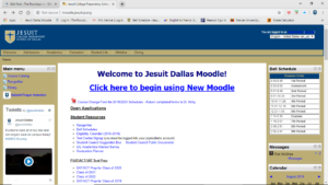
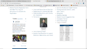
As Jesuit is making more technological innovations to accommodate a more modern future, they are getting rid of some of the older things such as Old Moodle. As I am writing this, incoming freshman and transfers, you may ask yourself, “There was another Moodle before this?” Short answer: Yes, there was, and there are many differences between the two websites. Today will be a comparison of the two, and my thoughts on adjusting to this new system. So to the class of 2023 and transfers who will not experience the absolute majesty of the Old Moodle, here’s a recap and comparison.

How does Old Moodle compare to New Moodle?
For one thing, Old Moodle was simple. Very easy to access and very straightforward. It makes sense why it is not overly flashy and nothing really stands out by itself, primarily because it is used for academic purposes and would just seem unnecessary. Nevertheless, it takes less scrolling to look through the home page on Old Moodle. Because all the necessary information is above the fold, you can easily figure out where you need to be, whereas on New Moodle, it takes longer and most information is below the fold.
However, the color theme and text style on New Moodle is much better. Personally, I’m not a huge fan of the beige and white colors on Old Moodle, and the Arial font just doesn’t bring life to Moodle. On New Moodle, the Montserrat font looks more modernized and livens it up, adding a bit more pizzazz. Also kinda digging this new Trending section. Keeps things up to date. Nice one, Batik.
Old Moodle seems more organized on the home page. By aligning all the sections in the center part of the page, your eyes naturally can scroll up and down to look for important things and makes it seem as if the space is filled. In New Moodle, your eyes have to take more time, glancing side to side to look for pertinent information. At the bottom, there is an huge empty space between the search bar and the Roundup page. What is that for? Even at the top, the words “Jesuit Dallas Moodle” are boxed in with just a plain blue covering. I think that adding a bit of style to that front box with some cool designs or artwork allows it to go from unappealing to stylish, kinda like with the thumbnails of the classes.
But, the home page isn’t everything, in fact, it seems more streamlined and efficient once you get into your classes page. It tells you your upcoming deadlines, and readily notifies you if you have any new things that Old Moodle makes you check yourself. You can also check your most recently accessed courses, logging back into them immediately in the case of a crash. The calendar is a nice touch for those who plan out their schedule ahead of time, and I wonder what they’ll do for the new IntelliBoard and grades features. Dashboard’s looking pretty snazzy.
However, it is hard to find specific people and contact them on New Moodle. In order to message them, they must be in one of your Moodle classes. However, in Old Moodle, I can figure out who’s online to contact them, easily find out what classes and activities they are in, and send a message regardless of whether or not I have a class with them. Much easier for contacting people.
Why did we make the switch?
Jesuit simply needed a more stable, stronger platform, and Old Moodle wasn’t up to the task. When asked about why we made the transition, Mark Batik answered, “We needed the stability of a cloud-based platform for our Moodle because we have been hosting Old Moodle on campus in an old server. There was a risk that we would stop working and lose all the information on there. Without worrying about physical hardware in a dedicated server, the cloud-based New Moodle becomes much quicker and much safer than Old Moodle ever was. Jesse McKneely expressed the same sentiment saying, “When I arrived about two years ago, we had a Moodle server that had been here for a while about six or seven years. It was, you know, kind of behind as far as versions… I just really liked how updates occur blur more frequently. There’s a lot more options a lot more ability to tie things in and plus just the mobile ability, especially considering everybody here has iPads being able to give out the ability to connect to it from an. It was something I wanted to do.”‘
Mr. McKneely goes on to say, “We actually purchased the service worked with Mr. Batik to kind of slowly roll it out in a way that didn’t scare anybody because we were making a big change a lot of the faculty had used the same type setup for many many years. we kind of took our time took a year to test and try different things.But so that was a slow transition, but it’s a big transition because of the age of the old one and then just going to new technology with it being hosted in the cloud. But because we took our time with it because everybody here was is already familiar with Moodle, it kind of helped make it a little easier.”
What do other students think of New Moodle?
”It’s okay. The interface looks cleaner, and more modernized. The timeline helps But, I’m clicking much more links. It took me 5 minutes to submit something for Theology. Teachers need time to adjust.” -Enrique Marroquin ‘21
“I like the classes portal. I like the testing schedule. The timeline and calendar helps keep track of my daily schedule and manage my time.” -Julian Garcia ‘21
Conclusion
I don’t see much wrong with Old Moodle, and I guess making the adjustment to New Moodle has been fine. It’s too early to have conclusions, but once we get used to it, I think that we’ll like it. My main suggestion is to liven it up and add some flair to it that Old Moodle never had. It’s a logical change, as students in the past often had troubles with Moodle, so I am optimistic about this new cloud-based software. What is your opinion on this change?
Check back to the Roundup for more viewpoints on Jesuit culture!
