[dd-parallax img=”https://jesuitroundup.org/wp-content/uploads/2023/02/My-project-1-2-1.png” height=”1000″ speed=”2″ z-index=”2″ position=”center” offset=”true” text-pos=”bottom”]insert your content to be over the parallax image[/dd-parallax]
Less is More
– By some photographer
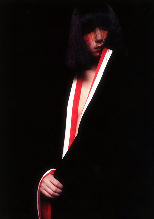
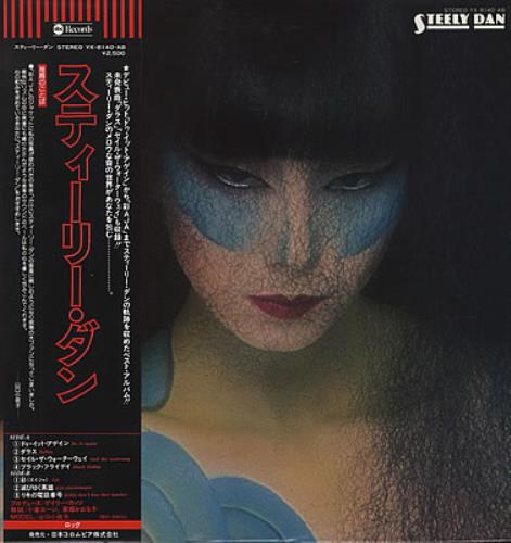
It is such a simple quote, only three words. Yet, it touches such a valuable and complex lesson in photography. Negative space is a powerful tool in the art of composition. It can evoke emotions of emptiness and hopelessness or display the vastness of the world instead of the frame. You can find countless examples of this form of composition within numerous scenes from films and photography. One of these countless photos that use this form of composition is the cover for the iconic 1977 Steely Dan album Aja.
To better understand the beauty of the photo, we must first understand the band this photo is linked with. Steely Dan is a band that is not like any other that has come before it or after. They are hugely mainstream or popular, ranking only 90th in Insider’s most popular band list. But popularity was never what Donald Fagan and Walter Becker (founders of the band) were all about. They made their music out of pure love for the art of music and sound. They are musical geniuses, with their signature jazz-rock combo filled with complex and rich sounds and rhythms. They are said to be the Stanley Kubrick of music, perfectionists who would never willingly settle for good or okay. And just like Stanley Kubrick, everything they do is done with a purpose in mind, including their album covers.
Aja, in many ways, was Steely Dan’s Magnum Opus. It was the band at its best, and their music was refined and truly embodied the Steely Dan style. The art of the album cover also reflects the band at its best. As beautiful as their music is, the album covers in the past were infamously ugly. But Aja broke this narrative for Steely Dan covers, and it made a cover that genuinely reflects what Steely Dan was.
Some Background
The inspiration behind the name Aja (pronounced like Asia) does not really have a deep philosophical background. Donald Fagan (one of the leading band members) would state the album name came from a Korean woman who married the brother of one of his high-school friends. The photo was taken by a Japanese photographer Hideki Fujii, using the Japanese model/actress Sayoko Yamaguchi. Both Patricia Mitsui and Geoff Westen did the graphic design for this cover.
The Photo
The album photo indeed does the style of the album. Aja’s album reflects the art of subversion. Every song in the album has cynical and dark theme’s within their lyrics hidden within their funky jazz-rock music. Many, if not all, of their songs, touch very dark topics within our world today. But the song that embodies this photo is the 2nd in the album, “Aja.”
Aja is the story of a passionless jazz musician whose music is seen by the mass as more of a spectacle than the beautiful art form he sees. No one seems to care about jazz in the musician’s eyes. The only thing that has meaning in life is the mysterious lady Aja (presumably an Asian Lady by that naming), who he visits as a relief from his primary existence.
The photo, in my opinion, can be an inscription in two different ways:
The Musician
The first way the photo can be looked at is the figure in the picture is the musician. The person in the photo is dressed in very bright and contrasting colors of red and white and wearing a very flashy outfit. The figure is like a clown reflecting what the musician (in his eyes) has become to the masses, nothing more than a sad showy display of a once great art form. It has devolved it nothing; therefore, the musician himself has devolved into nothing. He lives in the shadows as he is forgotten by the people he plays for, as they do not care. It is a cynical portrayal of his life, a depressed and unfulfilling one.
The Lady
The more probable inscription is of the mystery lady. An Asian lady likes the one in the photo cloaked in mystery, like the lady who hides in the shadows. We need to find out who she is. She is just a figure to us, one the musician finds great pleasure in being with. This is shown through the bright and colorful colors in the shadows that bring the musician a sense of purpose and ecstasy when being with them.
Conclusion
This is, so far, my favorite in this series. I can’t say why it is my favorite, but they’re just the air of mysticism I get when I see the photo. I can appreciate a few more pictures when I know what the album’s songs mean. While there might be a more popular album cover, Aja’s cover will never be one of the most fantastic album covers by the masses. And while another body might be similar to Aja, there will never be an album cover that captures the magic Aja does.
Stay tuned to the Roundup for more coverage on this series!


