


I have grown up playing and watching sports all of my life. If it’s a common youth sport, I have probably played it. I have watched thousands of hours of sports on television for…educational purposes…yes, that’s what I’ll go with. The truth is, it is educational because that is the research I have used to write this scientific article.
Through all of the sports I have played and watched, there is only one thing that is common throughout all of sports: athletes’ motivation to win. I have played for several different coaches and have heard of and studied several different coaching philosophies. But, I have only found one way to guarantee success on the field at every level. This is from legendary NFL cornerback and Jackson State’s football head coach, Deion Sanders. “Neon Deion” says, “If you look good, you feel good, and if you feel good, you play good.” It is as simple as that. Look good, feel good, play good.
A phrase that has grown in popularity in the sports world recently is “drip”. Unfortunately, the Merriam-Webster Dictionary does not define “drip” properly. Drip is a noun meaning style or good accessories. “The quarterback threw for eight touchdowns and shredded the defense due to him being covered in drip” is an example of the phrase in a sentence. It can also be used as a noun meaning possessing such style and/or good accessories. “The quarterback has drip.” Lastly it can be used as an adjective to describe a person who possesses such qualities as “drippy”. “The quarterback is drippy today.”
One way that players can achieve such drip is through their own power. That means having to buy all the accessories and clothing items to put together a drippy look. If they are playing at a higher level, maybe their program provides some accessories to help add to their drip for them. However, this only applies to individuals. If a program is truly dedicated to investing in a winning culture, then they should look to provide drip to their athletes in a universal way: uniforms.
In this article, I will making predictions for the success of several college teams based on their uniforms and their drippiness. This article’s opinions are only expressed my me and do not represent every Jesuit student’s thoughts.
Alabama
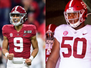
Despite their lack of refined uniforms, the Alabama Crimson Tide has found great success in football. One could argue that it was good coaching, but I am not that person because it is not coaching, talent, effort, or any of that nonsense that you have heard in the past that makes a team good. It is their drip. Their swag. Their looks. I think the reason Alabama has found success recently is due to each individual player’s natural drip. With names like Kool-Aid McKinstry and Tua Tagovailoa, how could one not ball out? I think that this year however, that ends. The teams have found that good uniforms win games and Nick Saban is too fixed on traditional coaching philosophies to understand that. If Alabama wants to do well, Saban must leave the program.
The uniforms are just boring. Not ugly, just boring. They look like your average run-of-the-mill middle school uniforms that has been handed down for generations with a giant hole just below the name paired with a helmet that your grandfather found as the “new technology” that you can get CTE just by looking at it. Many will argue about how they look traditional so it looks godly. I understand tradition, and how that may be cool to have historic uniforms. Just because it is tradition, it does not mean it looks good as a primary uniform. They need to wear these maybe once or twice a year as a “throwback uniform” and then they will be drip. As of right now, they are not.
Rating: 1/10
Record: 0-12
Postseason: not bowl eligible
Baylor
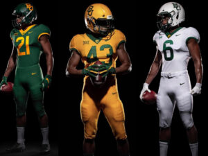
Baylor football used to be really out there with their uniforms, throwing some bear claws on the shoulders and having flashy chrome gold helmets. As a fan of Baylor, I may be bias, but I thought they looked pretty cool. Solid 8 or 9 out of 10 on most uniforms. I do understand the rebranding done in 2019 however, as they wanted a more universal look, something not often seen at the college level anymore. The thinking is that the uniform looks basically the same from football to basketball to baseball to track and so forth making a few small changes to adjust to their sport. The new uniforms are not bad, and not fundamentally boring. I think they look nice and are a solid option. Baylor will mix it up for many games, changing the jersey and pants or helmet colors with different pairings to create many combinations that excite fans. I am personally a big fan of when they put the throwback “Sailor Bear” logo on the helmets during some important games such as homecoming.
Rating: 5/10
Record: 6-6
Postseason: win in the ReliaQuest Bowl
Clemson
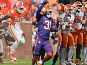
These uniforms have me thinking similar thoughts to Baylor. There is always a solid option and I would be glad to wear them if I were a player attending Clemson. I think the purple uniform usually worn on senior day is probably their best uniform. However, I think the all-orange could be argued as a close second. I think the helmet is one of the above average helmets in college football and I am a big fan of the purple and white piping in the middle.
Rating: 7/10
Record: 8-4
Postseason: win in the TaxSlayer Gator Bowl
Georgia
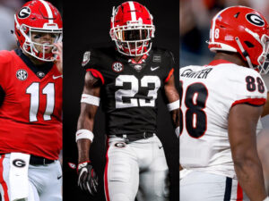
Georgia has also found recent success despite bad uniforms. I am never a fan of gray pants unless it is apart of an all gray uniform. Sadly, Georgia uses gray pants in both of their main uniforms, which breaks a big rule I have in uniforms. This rule is to never put a white jersey on gray pants. To make the look worse all of the piping and lettering use white instead of gray, so the gray stands out even more making it look like it does not belong on the uniform (which is does not). A simple fix to this would be to switch to white pants and their rating would improve significantly.
They also have a black alternate jersey but sadly they also wear the gray pants in the alternate look. Personally, I think the look would be improved with black pants to create a black out jersey. But white pants would also look much better than the gray in the uniform.
Rating: 4/10
Record: 4-8
Postseason: not bowl eligible
Maryland
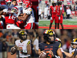
Maryland has received many negative reviews on their uniforms, primarily concerning their their helmets and sleeves resembling their state flag. This may be the hottest take of the article: I like the helmet and sleeves. I think it is a nice way to pay homage to their state and the colors of the flag match their color scheme. I do however understand where people may disagree with me, especially with the helmets as it is a lot to take in.
Additionally Maryland will also wear a red alternate helmet with “Terps” in cursive script on the side. Although the other helmets are solid, the alternate helmets are fantastic and should be their primary helmet.
Rating: 7/10
Record: 7-5
Postseason: win in the Cheez-It Bowl
Michigan
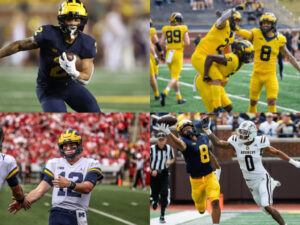
Michigan is also among the few teams to be sponsored by the Jordan Brand in college football. Overall, I like their uniforms more than most football programs, especially when they change up the look slightly by going all blue or all white. The maize uniforms resembling an NFL color rush uniform is spectacular and I would buy all the uniforms if I was a Michigan fan.
The big problem I have with these uniforms is the helmet. This is another example of schools refusing to change their uniforms based on traditions. I think it is a cool idea to resemble wolverine claw marks on their helmet as that is their mascot, however it was not executed well. The big blob of yellow before it gets into the individual claw marks really throws me off. Also, the fact that all of the marks are the same length throughout the whole helmet is weird.
Rating: 6/10
Record: 8-4
Postseason: loss in the Rose Bowl
Mississippi
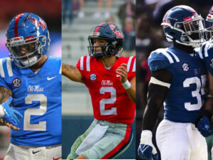
Ole Miss simply does not miss. Every one of their uniforms is great. They found a solution that works and they stuck with it in all of their uniforms. I love their colors and the script font one the uniforms and helmets. I do not think the uniforms are too boring and their baby blue uniforms have a real shot to be one of the best uniforms in college football. The one knockoff I have for them is they sometimes wear gray pants, however they have been wearing these less as the years have gone on.
Rating: 8/10
Record: 10-2
Postseason: loss in the Chick-fil-A Peach Bowl (CFP Semifinal)
Notre Dame
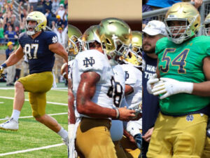
Overall, the Notre Dame uniforms are average. The uniforms are good, but nothing spectacular is happening. The big issue with these uniforms is the pants. The helmets look great with chrome gold paint that contains some specks from the famous gold Notre Dame statue on campus. However, the gold pants are atrocious. They look like the designer got sick when designing them and vomited all over the pants.
They also have a green alternate jersey they will wear occasionally, however they keep the gold pants with throws the jersey off. The helmet and pants are gold, but the jersey is blue and green? Notre Dame has a similar green basketball jersey that works out well because it is all green. I think the uniform would be better if they did that with these uniforms, making it an all green uniform and could probably still keep the gold helmets if they got green pants.
Rating: 5/10
Record: 6-6
Postseason: loss in the Boca Raton Bowl
Ohio State
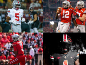
Ohio State breaks a big rule mentioned above earlier with Georgia as they wear gray pants the majority of the time. While I like it better when they wear white pants with their uniforms, I do not think the gray pants look ugly. They have some of the most iconic helmets in college football as each helmet is unique to the player. Each time a player does something that a coach deems worthy, whether it be an impressive play, success in the classroom, or hard work, they receive a small circular sticker with a buckeye, their mascot on it to put on their helmets. While the buckeye is probably the lamest mascot in all of NCAA, a literal nut, once a helmet if full of stickers it looks rather impressive.
The Buckeyes also add in a “color rush” uniform from time to time, whether it be the “icy whites” all white uniform or an all red uniform which I think looks really clean. My favorite of these however is their all black uniform complete with a black helmet to top off the look. The uniform looks dirty, in a good kind of way, like a dangerous bad guy type style.
Rating: 7/10
Record: 8-4
Postseason: loss in the Goodyear Cotton Bowl
Oregon
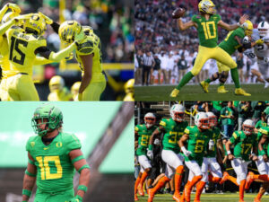
Oregon is known to have the best uniforms in college football, rarely wearing a look more than once in a season. The main reason for this is because Phil Knight, the co-founder of Nike, is an alumni of the school and a prominent booster. I like every look that Oregon puts out and think they are some of the most ‘modern’ uniforms in football. My favorite uniform is their duck uniform seen on the bottom right wear their uniform is meant to match their mascot.
The one issue I have with these uniforms is the helmets. I like the wing design on the sides, however the “O” logo on the back throws me off a little bit. I’m not sure why.
Rating: 9/10
Record: 12-0
Postseason: win in the Playstation Fiesta Bowl (CFP Semifinal), win the the National Championship
Texas and Texas A&M
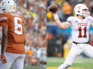
I have the same thoughts for both these teams, because they share the exact same traits For schools that hate each other so much, they have the exact same looks. Same boring fonts, only two colors on the whole uniforms, plus their basic logo on the sides of the helmet, just made unique to each schools logo and colors. None of their uniforms look bad, just boring. This is probably why it is always “their year” then proceed to lose to the worst opponent on their schedule. No matter how good Quinn or Jimbo can be for their respective teams, bad uniforms are something you can’t outperform.
Rating: 4/10
Record: 4-8
Postseason: not bowl eligible, though the fans will tell you exactly how the referees screwed them over in each loss
TCU
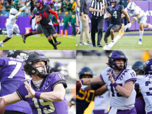
In my opinion, TCU bears one of the coolest uniforms in college football. Maybe not the best, but the coolest. There is a difference. The collar, the horned frog on the helmets, everything just works to perfection on all of their uniforms providing every player who puts their jersey over the pads massive drip. They also wear a dark gray/black alternate with red accents that I do not totally understand the red, however it still looks cool.
Rating: 9/10
Record: 11-1
Postseason: win in the Chick-fil-a Peach Bowl (CFP Semifinal), loss in the National Championship
Concluding Thoughts
Drip is vital to a team’s success. It is the new, modern coaching philosophy that will be taking over all of sports. While no team has achieved an overall rating of 10/10, several have individual uniforms worthy of a perfect score such as the 2022 Utah Rose Bowl uniforms and many special Army-Navy uniforms for annual rivalry game. Sadly, none of the teams wear the uniforms enough to constitute it to be in the regular rotation for judging. Hopefully one day, all teams in every league around the world has perfect 10/10 drip.