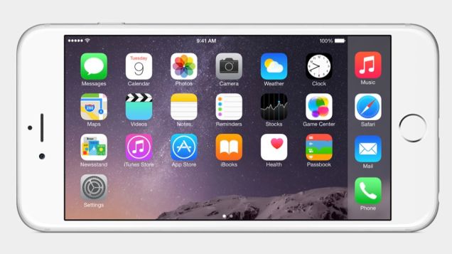
“The biggest iOS release ever.”
This bold claim stands front and center on iOS 8’s website, alluding to the grandeur of Apple’s latest software update that accompanied their new phones, the iPhone 6 and iPhone 6+. I hope this quote is only trying to make a pun about the new versions having larger screens, because if not, it stands as a perfect example of PR trickery and customer misguidance that is all too prevalent in today’s market of cutting edge technology.
To put it simply, I have not found a single new feature on my updated iPad that I have used naturally. Over the course of a week, I have dug around the settings, read lists of the features, and generally explored the update, but all I have come up with is the question, “Why?” Why would I need this? Why was this feature not here to begin with? Why did people think this warranted an update?
Finally, I believe I have figured out the answer: an update is expected. With the new iPhone, people have come to expect an update, something new to experience. However, this generation seems to be scraping the bottom of the idea barrel. In fact, Apple seems to be playing catch up to their competition in that they have finally released a phone that has a screen size on par with that of Android devices and software features that have been staples of Android software for years. Hardly any original features from Apple have been seen lately, though they have all been marketed as ground-breaking.
When you first update, if you update, you can see that, visually, nothing much has changed. After the complete visual overhaul that was iOS 7, leaving most devices significantly slower, I am very thankful to see restraint by Apple. However, it is still nearly impossible to get your preferred background picture to fit correctly due to their insistence on frivolous graphical features that I can’t immediately turn off, let alone even notice.
Looking solely at the features now available on the iPad as of iOS 8, here are some of the more noteworthy ones:
- Battery usage: You are now able to see a breakdown of how much power each app is using to better manage the device’s battery life.
- Favorite Contacts: When opening the application switcher, favorite contacts will now appear above. I think the implementation is neither stylish nor in a useful place, but it is still welcome as a feature.
- Credit Card Scanning: Through Safari, you can scan your credit or debit card with the camera to immediately enter it into the applicable boxes. By far, this is the most seemingly useful feature, but, as to be expected, autofill is still the quickest way.
- Changeable Keyboards: It does exactly what it sounds like: you can change your keyboard to one you downloaded from the App Store. I was very excited for this, but after a day’s use, I gave up due to the slow and buggy implementation.
It is sad to say that these are by far the most intriguing of features. With most not even worth mentioning, I encourage prospective updaters to look at a complete list of changes.
Looking back at the quote, it is almost a joke about how wrong it is. If you choose to update, I can almost guarantee that you won’t find one useful feature that is worth the possible bugs a new update brings. iOS 8 is a mishmash of small additions that should have been released on their own throughout the year as they were finished. Instead, it seems Apple needed to save them all, put them in a single update, and release it under the name iOS 8 so they would have at least something to go along with the new iPhone. In the end, I do not suggest updating.


