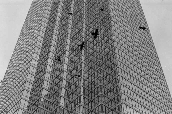
[dd-parallax img=”https://jesuitroundup.org/wp-content/uploads/2023/02/1216x804x2.jpg” height=”800″ speed=”2″ z-index=”2″ position=”center” offset=”true” text-pos=”bottom”]Dallas R2. Credit: Alienmeatsack (Lomography)[/dd-parallax]
Intro
One of my favorite films when it comes to it cinematography is The Tragedy of Macbeth (2021). The film is made by Ethan Coen, one of the famed Coen brothers. It is an adaptation of the 1606 play by the legendary writer William Shakespeare. While the film itself is probably now forgotten by many, its cinematography has always stunned me. Where the cinematography is at its best is now it is worked into with the architecture and design of the sets and building on the settings. Pairing with the eye candy black and white footage gives the film a sense of dread and power, which help you get into the film. Today photo’s are of buildings similar to that of Macbeth. But instead of a structure from a far past, it is one we can find in our city of Dallas.
Background Info
Like many of the photos in this series, I found it on the website Lomography. The photo was taken by an artist who goes by the name alienmeatsack, and the picture itself, which is name Dallas R2 is a part of the album Downtown Dallas R2. The camera used for the photo is a Leica M6, a very high-end (and expensive) vintage camera, with a Leica Summicron 50/2, a very expensive vintage product. The image is of the Bank of America Plaza, which can be found in downtown Dallas. Bank of America Plaza, or BAP, is the tallest building in all of Dallas, standing at an impressive 921 feet.
Why I Like the Photo
The first thing that catches my eye upon a closer look at the photo is how it is pretty grainy. It is not a bad thing. It helps build a sense of dominance and power within the photo. The graininess in the picture for the background makes it look old, and along with the clear sky, it helps us zoom in on the main object of focus in the center. The oldness the graininess gives it helps convey that the main structure is old itself, but it is still a mighty and pretty modern and seek building.
The second thing that draws me in is how the photo is framed. It only shows the center of the building, not the top or the bottom. It is a building that is too tall for us to visualize, soaring far beyond the sky in which the bird flies. But never show its earthly attachment to the ground, it is a structure that has this godly and all-powerful presents. The angle used in the photo also helps build this sense of power with the subject.
The angle is a low-angle shot that is commonly associated with power. At least in filmmaking, it is a technique to show your subject having authority within a scene. And this angle helps emphasize this sense of power within the building. The birds in the photo give the photo depth. It helps build the sense of the magnitude of the building again. But it also provides the picture with a sort of eerie untuned of death or dread.
The final thing to note might just to the building itself. If you look at the building itself, you notice that the building design makes it to that the glass reflects off another side of the siding, meaning the reflection of one side of the building can be seen in the photo. It is an interesting feature that creates this effect where the only thing you see in the building is merely a reflection of the building.
Conclusion
Below are more photos from this album, but I highly recommend checking out the album. It is worth a glance. There is always something awe-inspiring about architecture. It is a testament to humanity and our evolution as a species. Buildings that can soar above the cloud. Cathedrals so elaborately design it seems to defy our own imagination. This is why I love the photo because it shows human greatness. It’s about building our symbols of power and a testimony to humanity ongoing legacy. This is truly a relic to our past achievement, and give insight on one’s yet to be conquer.


